
In 2017 Lyft began to reimagine the Rider App in order to create a coherent design language that was more intuitive, clean, and could account for upcoming key features. My responsibilities included: creating user experience architecture for the core flow, designing pixel perfect mockups, iterating on concepts and building prototypes for demoing to executives. I also collaborated closely with the research team on user testing of the rider experience.
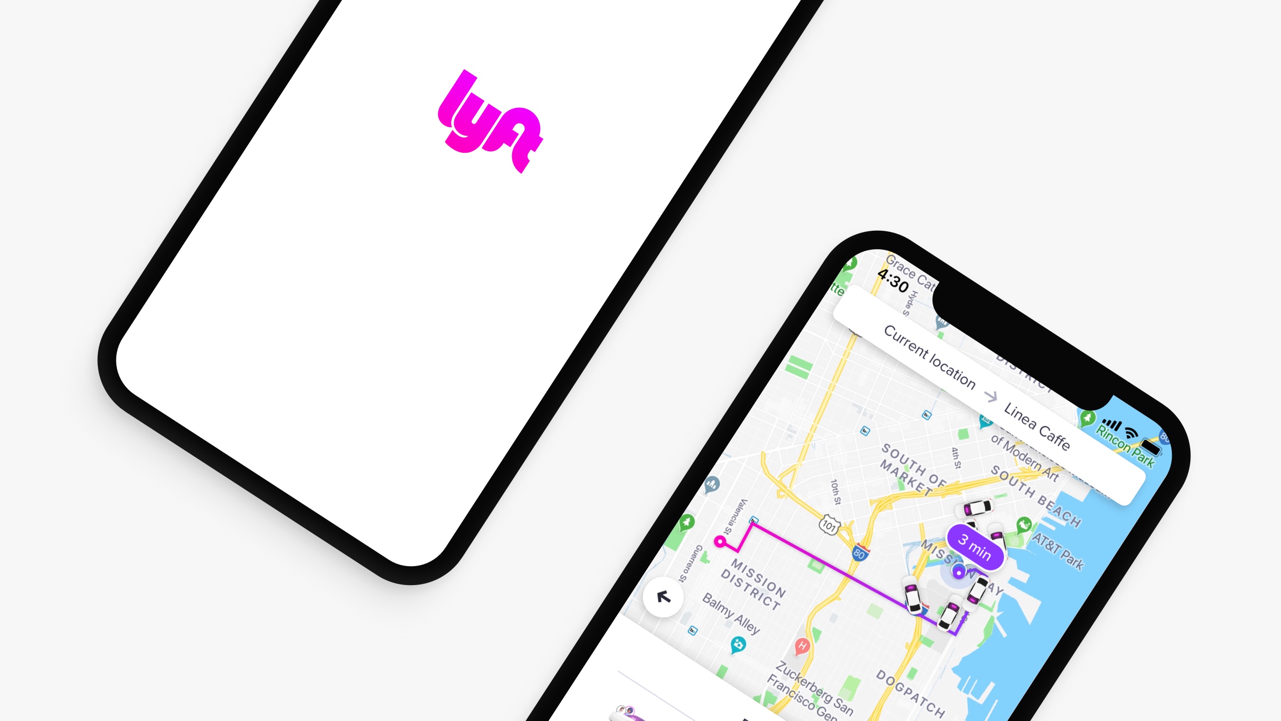
Lyft Rider App V4 (Previous Version)
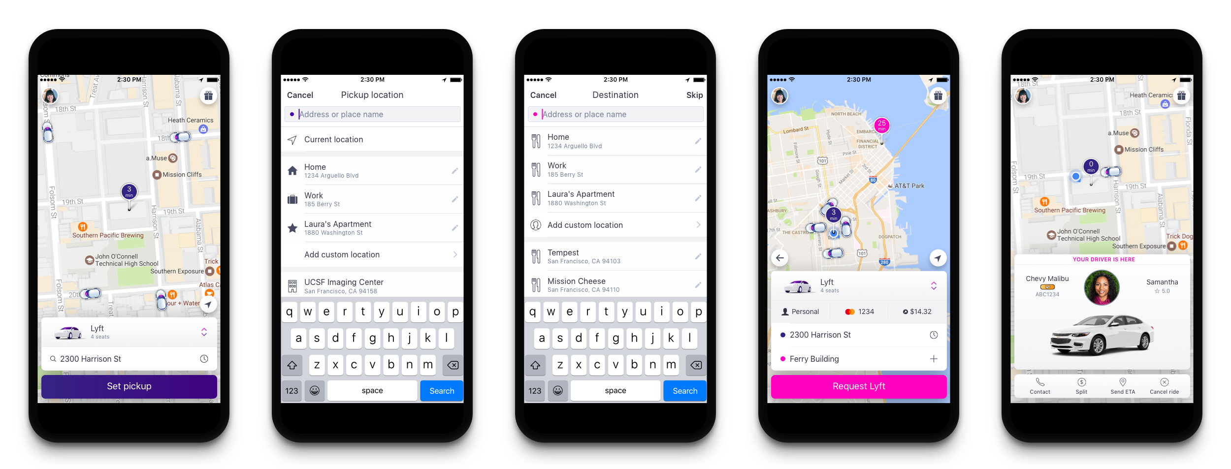
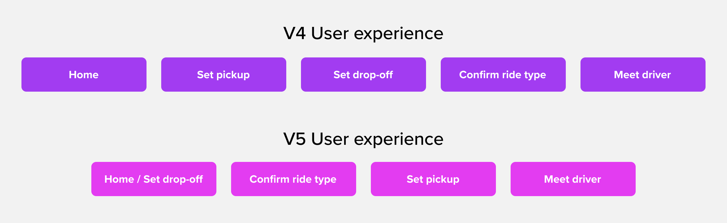
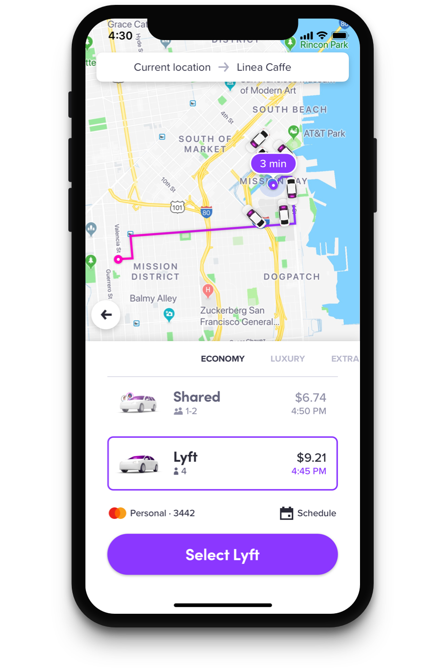
One of my main contributions was remapping the user flow so the rider could set the destination of the journey first. This reduced the total number of steps in getting a ride. It also unlocked the ability to compare routes, time to destination, and cost in just one tap.
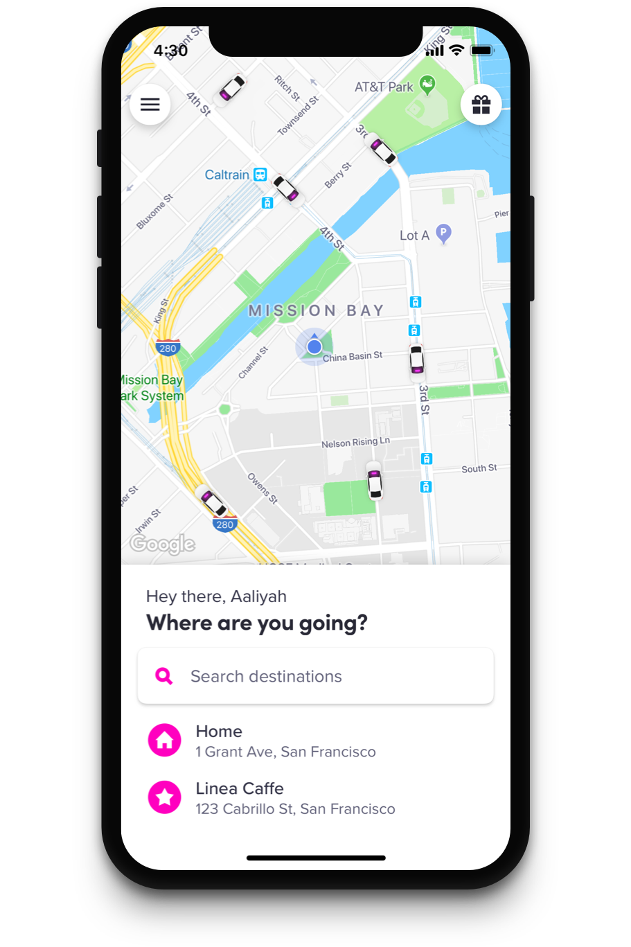
We iterated on many designs to represent density of cars in the area and favorite/suggested locations to go to. In the end we landed on the familiar cars on the map, a big search field, and two clear recommended destinations.
Lyft offers both high end rides and economy rides with longer route times. We needed to have a screen that lets users compare and choose the ride type that best fits their needs. I designed and prototyped many mode selector concepts that lead to this design.
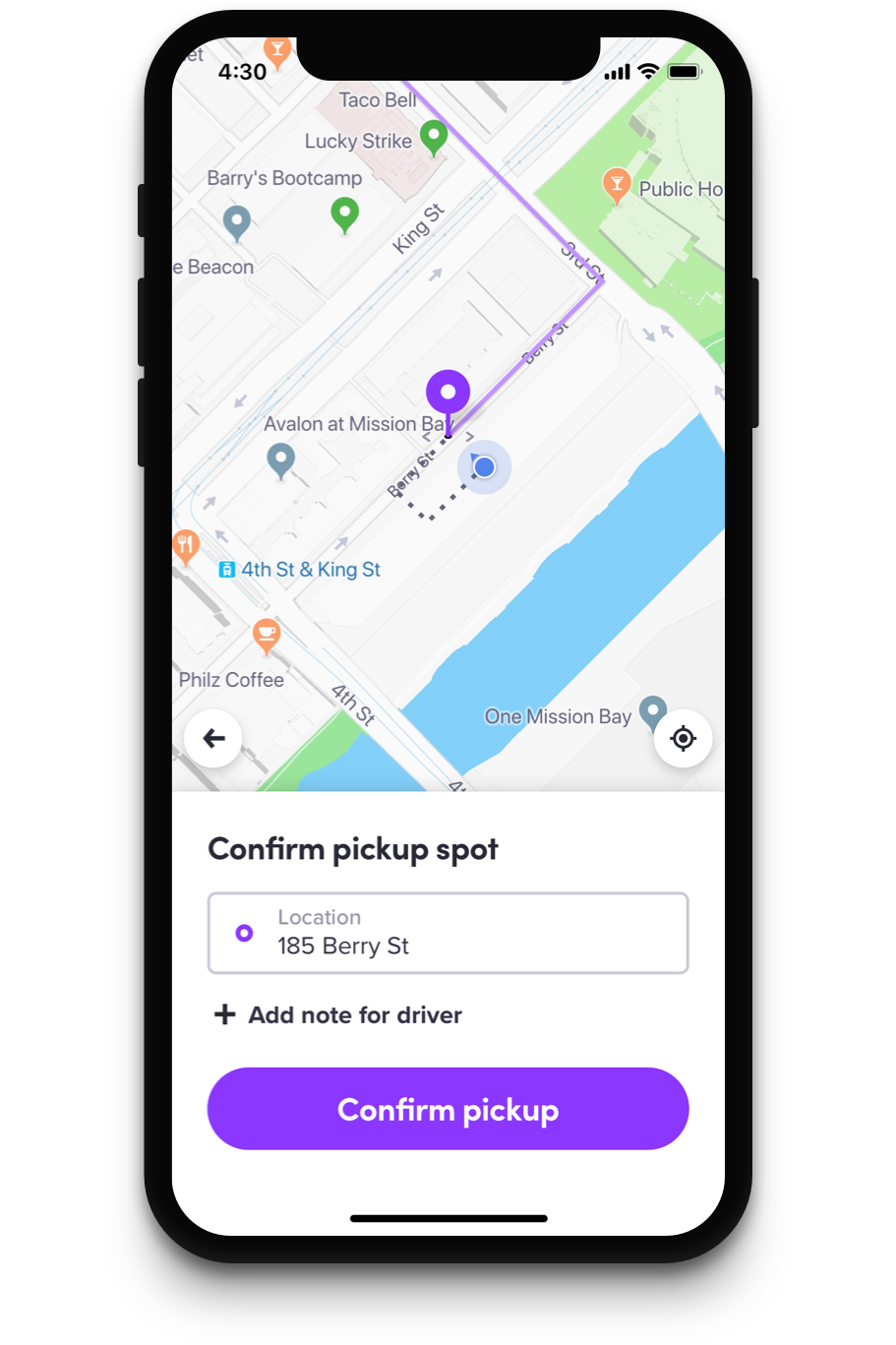
Because GPS can sometimes be unreliable, we added a step that asks the rider to confirm their pickup location. The two key functions of this screen are ensuring that the customer knows where they should meet their driver, and fine tuning the pickup location if the GPS is wrong.
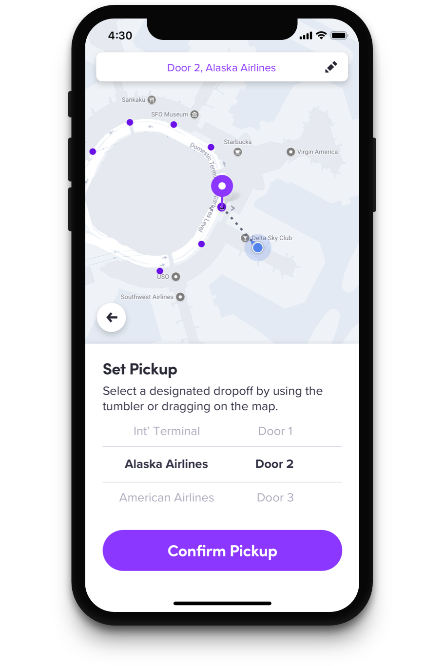
In some locations, pickups are restricted to designated spots. For these instances we developed a tumbler system to show the passenger all available options. This system is used at most airports and venues.
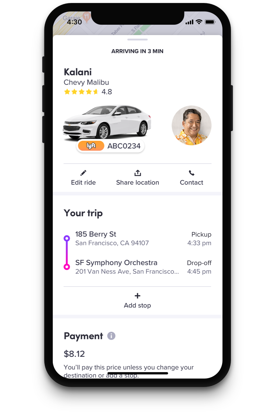
The passenger can always swipe on the bottom card to get more information. We designed this panel not only to give more details about the trip, but also to create space for upcoming features.
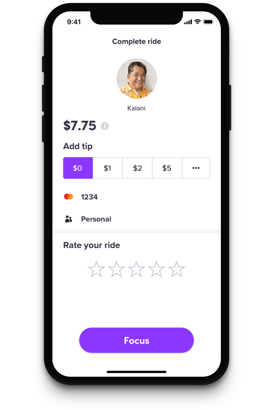
When the user presses any tip amount, even if it’s zero, they will then be asked what they liked or did not like about their ride. In this way, we prioritize our drivers getting paid while still getting valuable rider feedback about the ride.
Within a month after the app launch, Lyft saw an increase of 1.24% in rides taken - roughly 50,000 rides.
The Lyft Rider app has won Material Design’s 2018 Innovation Award and Core 77’s Notable Interaction Award.